
Level NYC was commissioned to design and develop a website that fosters deeper collaboration and engagement across the Newark and Rutgers University communities, while effectively communicating the organizations’ impactful mission. Over the course of a year, we’ve partnered closely with Express Newark leadership, program directors, and community stakeholders to bring expressnewark.org to life.
Express Newark Website
Front End Development
Strategy
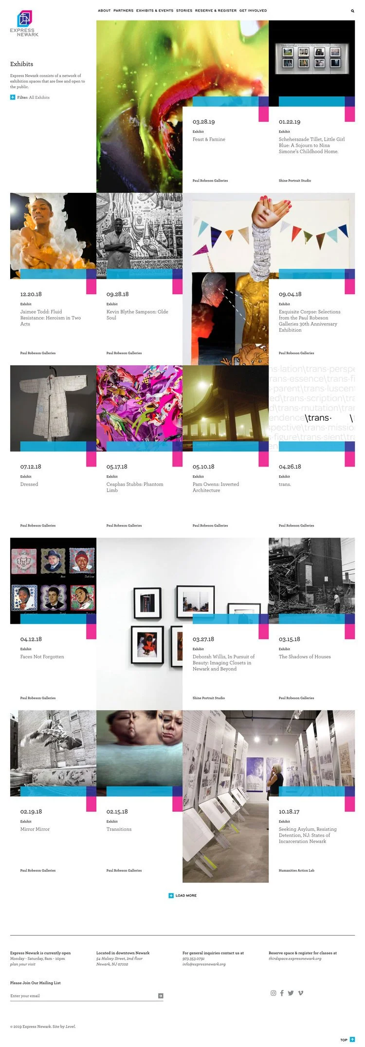
Exhibit page
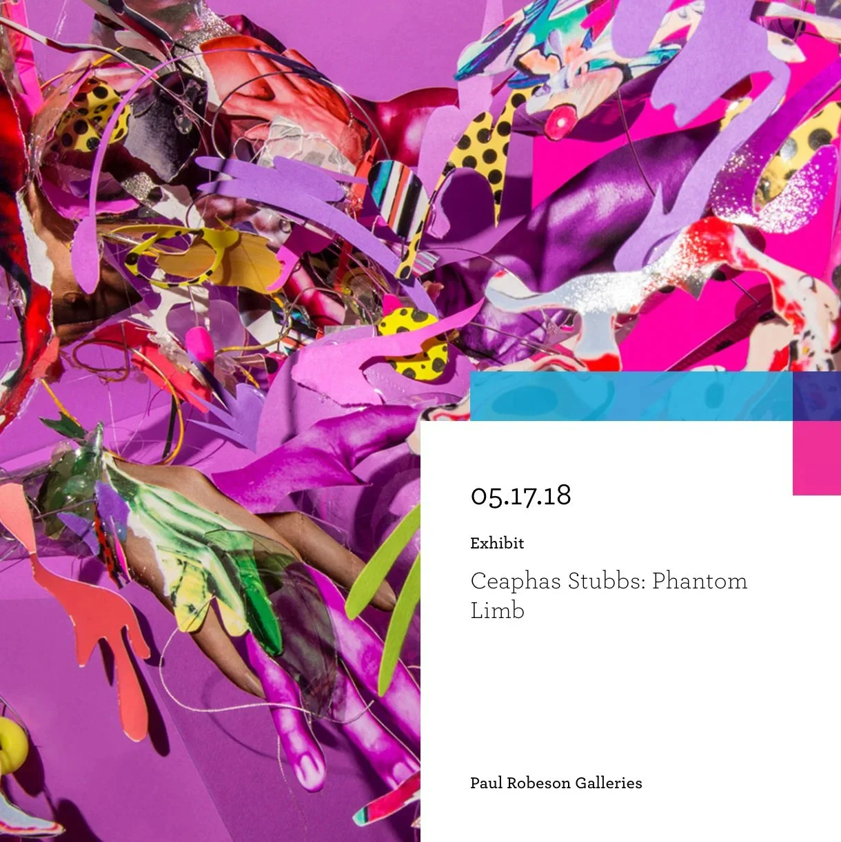
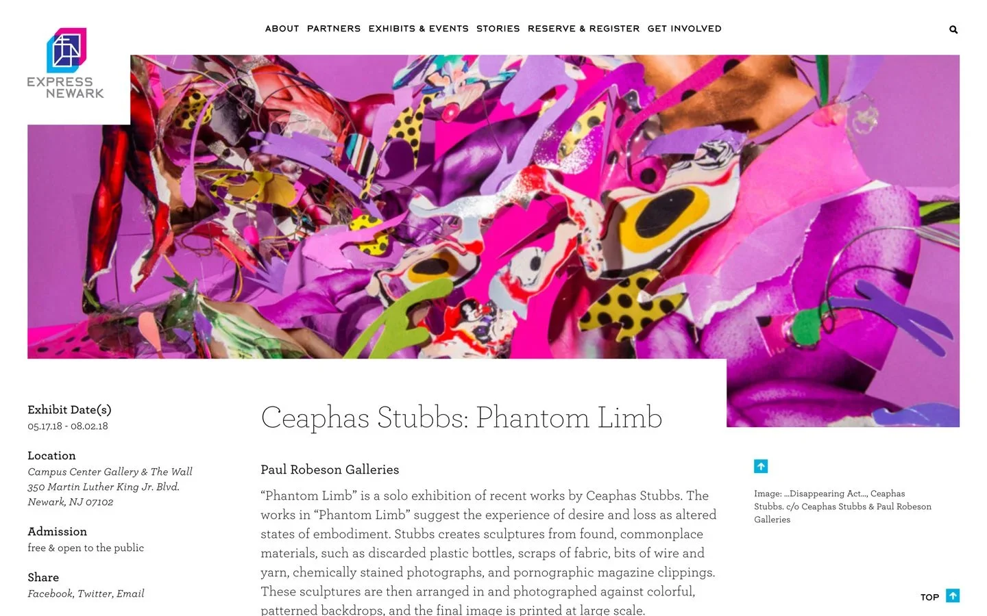
DETAIL PAGE
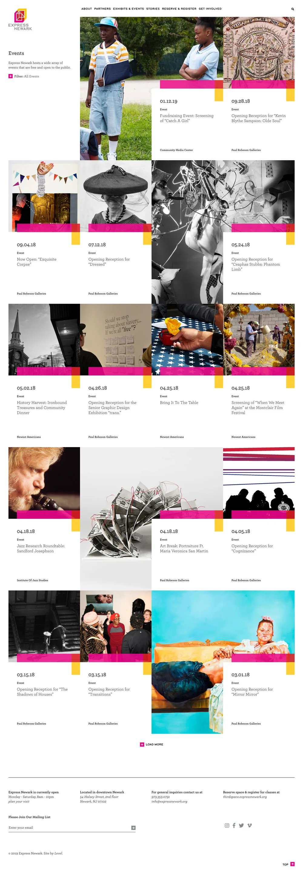
Event page
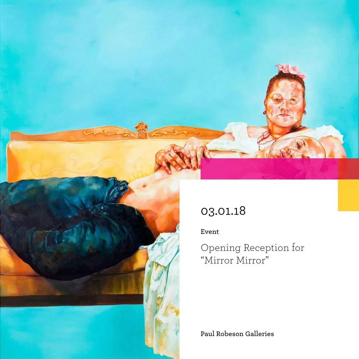
Print
Strategy
LANDING PAGE THUMBNAIL
LANDING PAGE
LANDING PAGE THUMBNAIL
LANDING PAGE
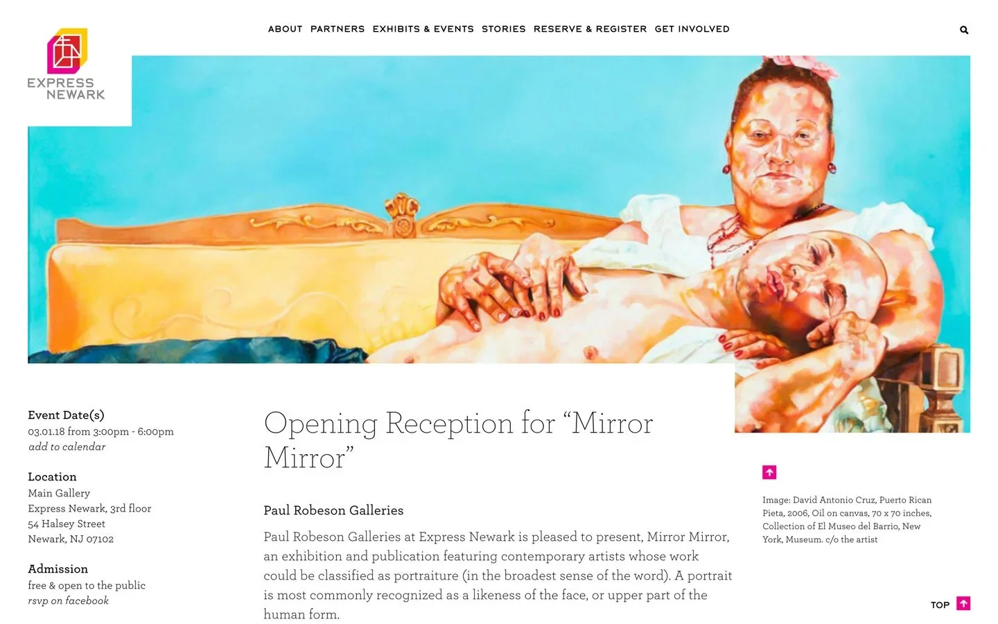
DETAIL PAGE
The Express Newark website was designed as a collaborative digital hub, giving each community and university partner a dedicated space to share stories, events, and creative work. A color-coded system inspired by the brand’s “third space” concept brings all content together into a dynamic, unified experience that reflects the energy of the Express Newark ecosystem
All work displayed above was created while working at Level Design Group and remains the property of the studio. Shown here for portfolio purposes with full credit to the Level team and creative direction.
The project focused on the development of the signage and wayfinding system, translating the core identity into a functional spatial experience. The Express Newark logomark and its underlying concept of 1+1=3 directly informed how we approached navigation throughout the building.
Each floor’s color system — derived from combinations of cyan, magenta, and yellow — became the foundation of the wayfinding strategy. The distinct third hues assigned to the 2nd, 3rd, and 4th floors allowed color to function not just aesthetically, but directionally, creating intuitive visual cues that guide visitors through the space.
Express Newark Signage
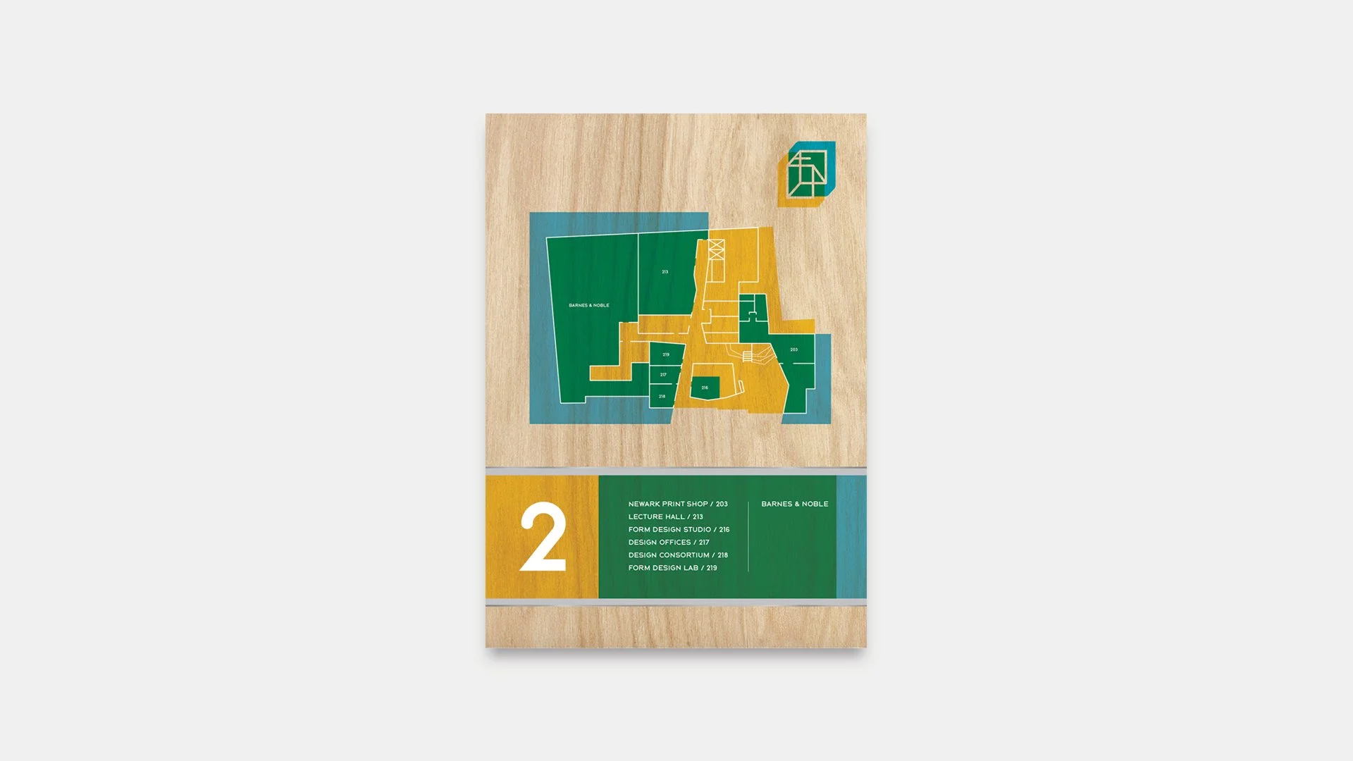
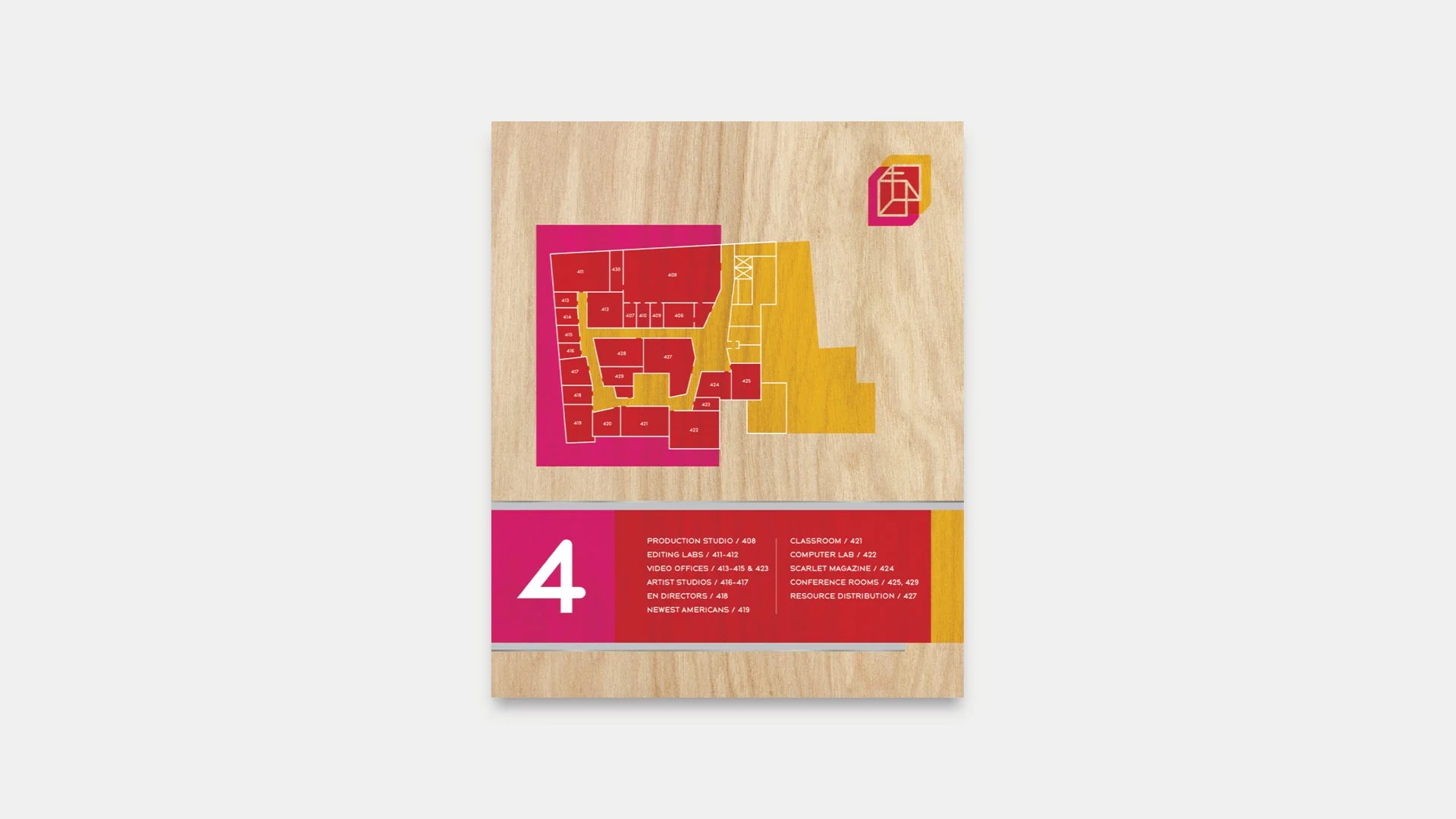
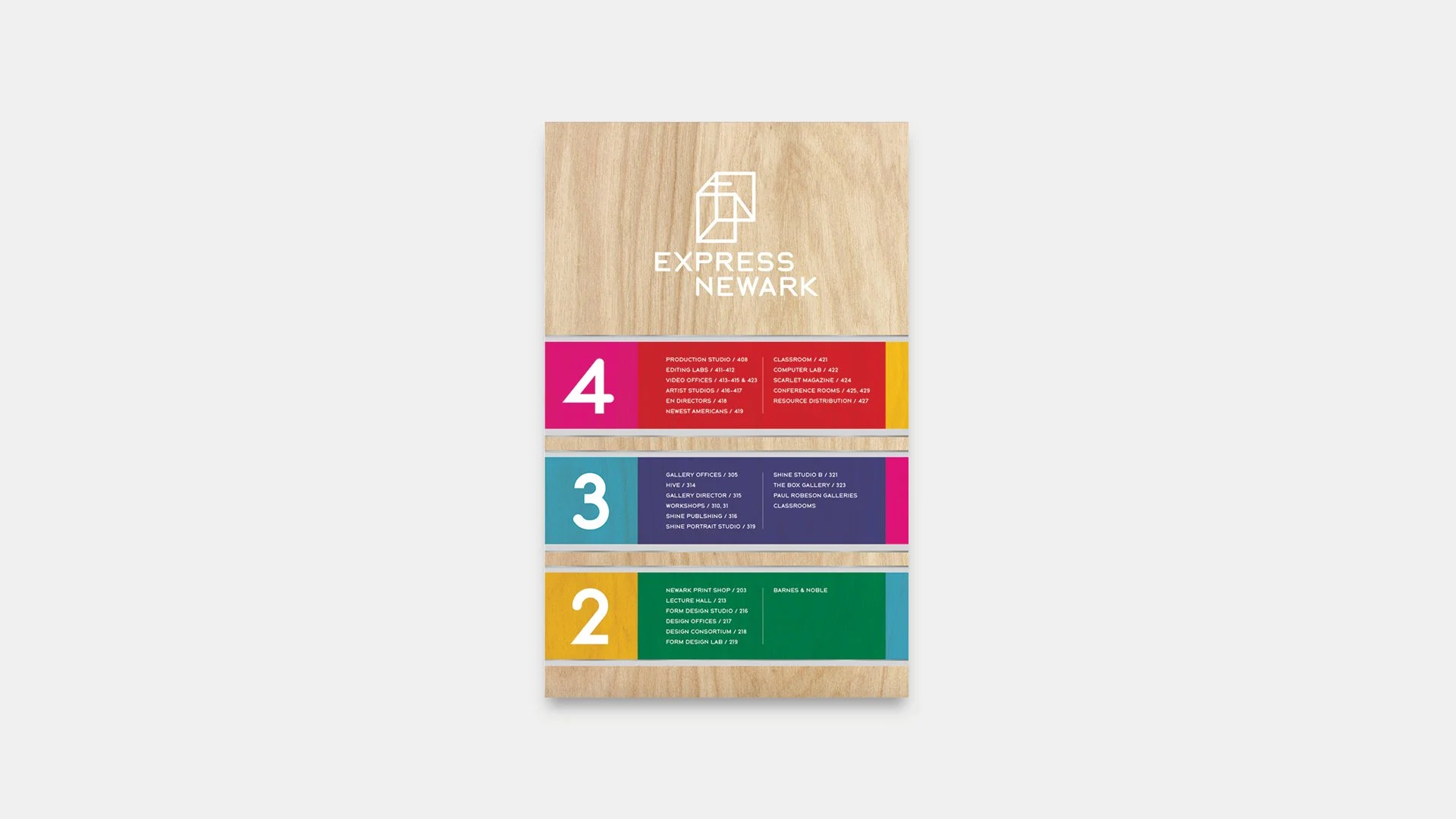
Typography also played a critical role. The custom typeface, BUBBA_PRO, originally developed from the formal qualities of the logomark, was extended into the signage system. Room numbers, directories, and wayfinding elements incorporate BUBBA_PRO alongside Braille and modified universal symbols, ensuring both conceptual cohesion and accessibility. Even functional glyphs — including custom arrows and symbols — were designed to reflect the typeface’s alternating curved and straight terminals, reinforcing the identity at every scale.
Materiality further grounded the system. Signage was applied on smooth birch plywood bases, balancing warmth and functionality while maintaining consistency with the spatial design.
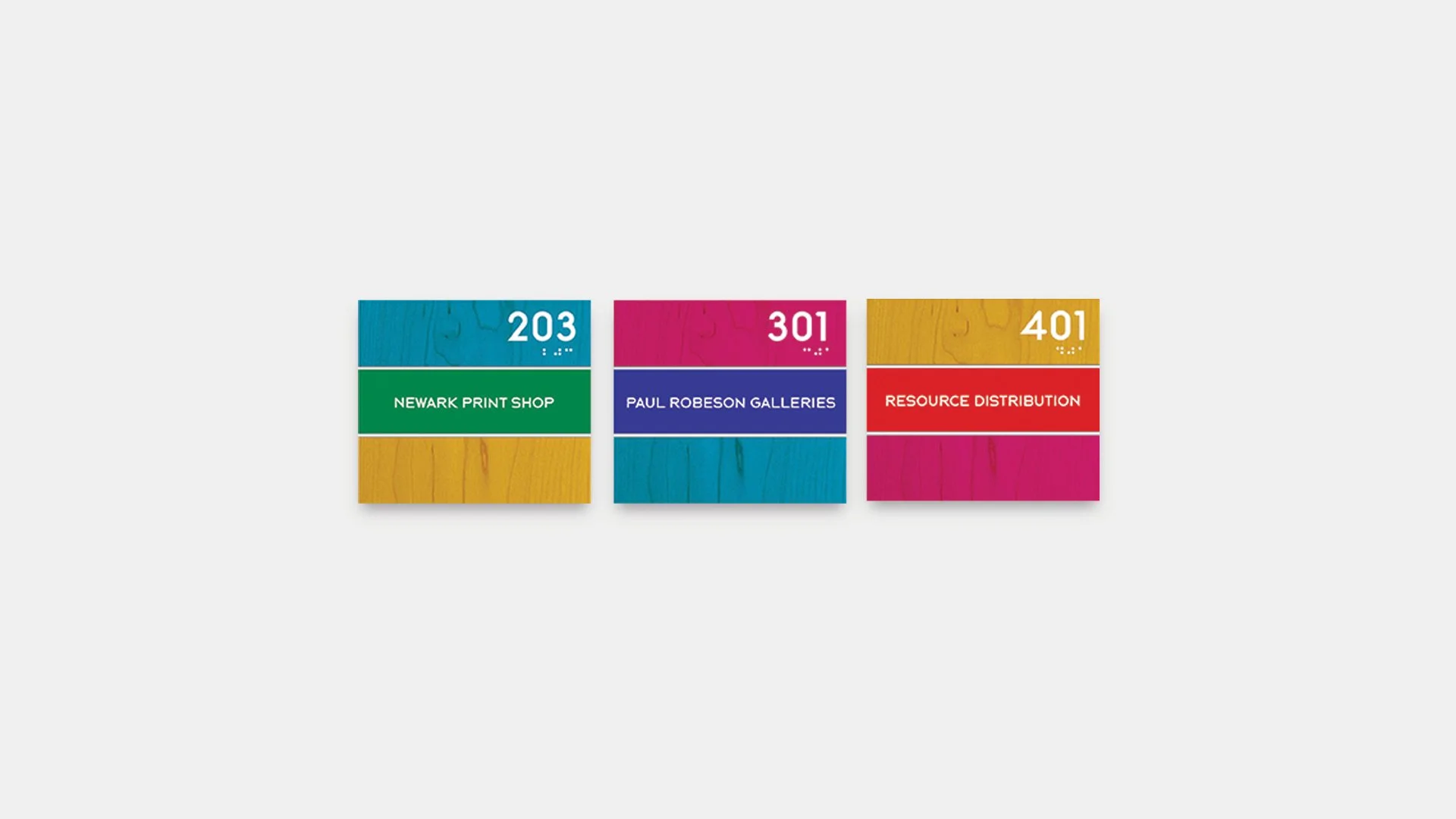
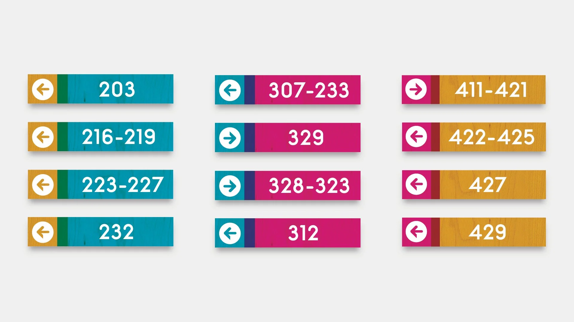
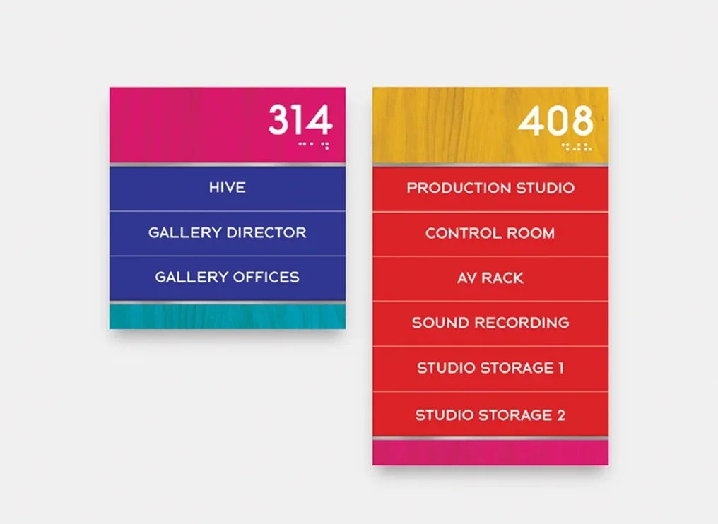
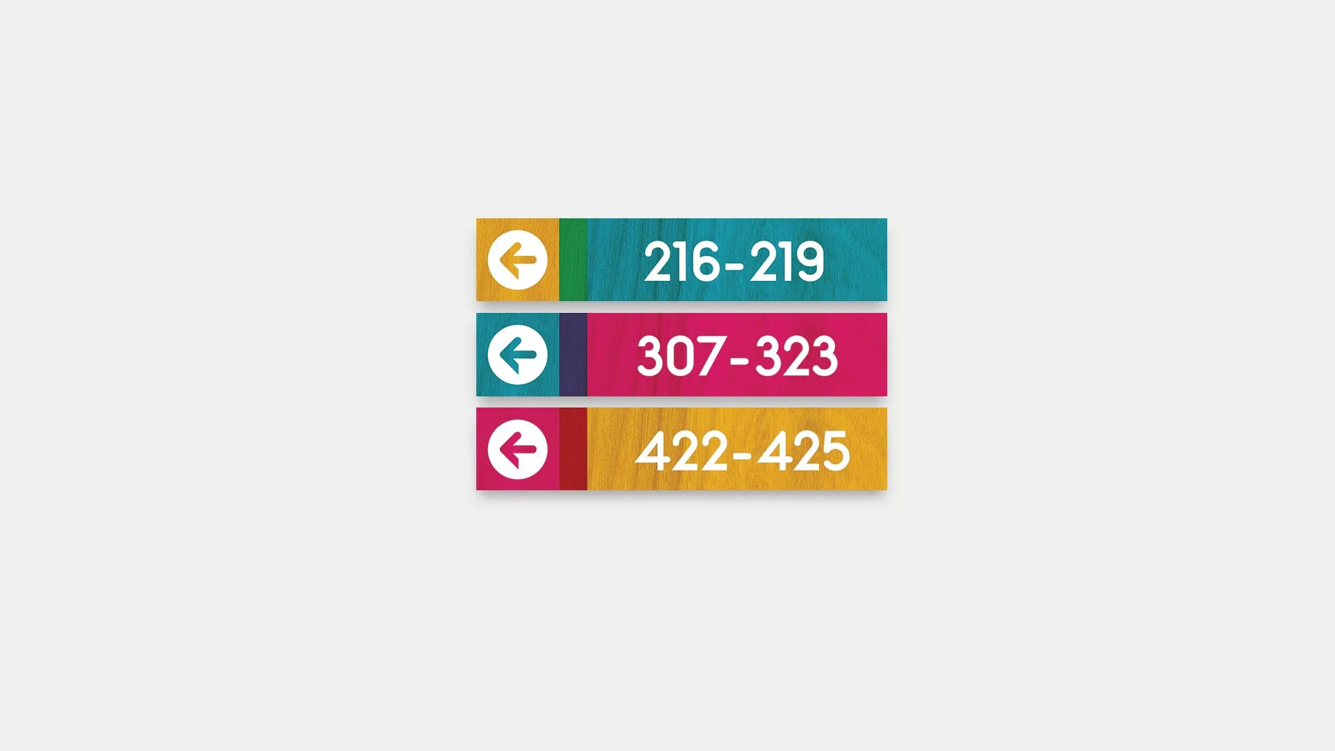
The result is a cohesive wayfinding system where branding and navigation are inseparable — color, typography, symbol, and material working together to embody Express Newark’s concept of a “Third Space.”
All work displayed above was created within the Design Consortium course at Rutgers University—Newark under the supervision of Professor Jennifer Bernstein and remains the property of the university and Express Newark. Shown here for portfolio purposes with full credit to the course, university, and creative direction.